
In my Media and Popular Culture course in the Media Studies Department at The University of Tulsa, students embraced a final project that they ultimately described as “daunting and interesting,” thoughtful and painstaking,” a “strenuous yet rewarding undertaking,” and “a welcome challenge.” The assignment? To translate a 1,500-word research essay into an infographic. Less about visually representing complex data sets, this assignment sought to develop practical and creative skills in argumentation and flow, clear and concise writing, and the representation of complex ideas and concepts.
Here I share details about this infographic project for instructors who might like to try something similar.
Foundational Reading
We began by considering the history of infographics, all the way back to the first maps as the visualization of data. We considered how institutionalized data collecting in the 19th century furthered such techniques and created a new type of citizen, one comfortable thinking statistically. From these early examples came tried and true infographic concepts, such as “speak to the eyes.” This foundation proved useful for students, as one later wrote, “Gaining an understanding of how these graphics began as maps and charts to condense information and solve problems was a fascinating introduction to this material.”


From Alberto Cairo we considered how infographics function as “visual arguments” with cyborgian abilities that extend our human capacities. We learned that as infographic creators, we must think as craftspeople “to design devices to make people’s lives easier, not to entertain them, or to sell them an idea or a product.” These ideas resonated with students who remembered later that “design is the second most important thing and to not let it distract from the information.”
We also considered the practical, editorial, and financial challenges of creating infographics within professional journalism and critiques of infographics: that they indulge those who don’t want to read, that they focus more on design and going viral than distributing civic data, and that they’ve grown so promotional they are indistinguishable from advertisements.
Armed with this historical and critical background, students were able to conceive of infographics in deeper and more complex terms, even as they turned their attention to practical concerns.
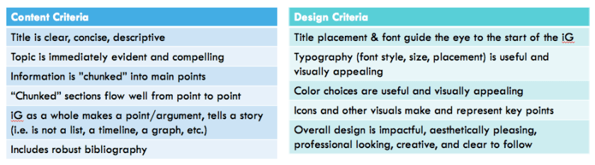
Learning Design Basics
We next read basic guides for creating effective infographics like this and this. For a homework assignment, students brought into class examples of effective and less effective infographics so that we could learn what to emulate and what to avoid. From these examples, we created our infographic rubric:
Scaffolding the Assignment
1. Storyboards. Students began the project by creating storyboards, based on the following assignment prompt:
Based on your research paper, create a storyboard, that is, a sketched-out rough draft for the information you plan to include in your infographic and how you plan to visually arrange it. Consider what evidence and key points are truly central to the argument you’re making and how you’ll “chunk” them. Consider textual components like your title, headings, subheadings, and blocks of text, as well as the visual elements like icons, images, graphic representations of data, etc. You don’t need to think yet about fonts, colors, and other aesthetic concerns, but you are welcome to do so if you feel ready. The more developed your storyboard, the easier the drafting process will be. You are welcome to design your infographic from scratch or use a template on Canva or Piktochart.
2. Storyboard Peer Review. In class, students peer-reviewed one another’s storyboards, using the form below. Building from that feedback, students reflected on the current strengths and weaknesses of their storyboard and planned their next steps.

3. Infographic Drafts. Students then created drafts of their infographics, addressing both content and design. Some students designed infographics from scratch, but most used templates from Canva or Piktochart, which worked well.
4. Infographic Draft Presentations. Students presented their drafts in class. This provided time and space to practice oral presentation skills and for students to share their research topics with their peers, expanding the breadth of pop culture content covered in our course. Students also gave peer feedback (on a designated form) to three others in the class, ensuring multiple comments (in addition to my own) on their drafts. Students appreciated this feedback, as one student wrote, “If I did not have people to critique my infographic, there would have been no possible way for me to understand my errors or even to realize mistakes.”
5. Final Infographics. Students submitted their final infographics to a Google Slide deck before our last class meeting so that we could share the final results with one another, ending with a round of applause for students’ effort and growth.
*********
What We Learned
1. How to fine-tune an argument and write concisely.
While a number of students emerged from this assignment with a new ability to write concisely, this was no easy task, or as one student wrote, “Condensing complex concepts into an easily digestible, understandable, and aesthetically pleasing format like an infographic takes a lot of time, effort, and planning.” This is an iterative process, which one student summarized as, “The process taught me how to better pick out the most important information from an essay and how to analyze and interpret that information in order to report and illustrate it in a concise and impactful way that will reach the broadest audience.”
2. How to truly revise.
As one student conceded, students often perceive revision as simply “correcting spelling errors or formatting,” and it can be difficult to help them break through that. With infographics, a student found that the assignment “pushed me to delete entire sections and rework the draft so that the information would effectively align with my argument.” For one student, his “final infographic contained a more developed argument and newly found information that was not originally in my research paper.”
3. How to embrace new and difficult tasks.
Creating an infographic was a new endeavor for all of us. One student reflected, “I learned that the development of an infographic takes hard, concentrated, and deliberate work to produce a quality and effective infographic,” while another characterized the assignment as “a lengthy, detailed, and conceptual task.” One student concluded, “This project showed me a whole new way of presenting information,” while another remarked, “I have learned so much about pushing myself to think outside of the box, and in different ways than I had before by doing this project.”
**********
In the end, students said that the “infographic project was one of a kind” and that “the entire process was a highlight of the course.” Beyond such learning, I’m delighted to share a few wonderful infographics below (click to enlarge) from students William Bennett, Claire Lenz, Lydia Jeong, and Maria Donnelly.


By Maria Donnelly

Wow! Such an inspiring teaching task. Thank you for sharing Emily.
LikeLike
This is brilliant
LikeLike
I second the “brilliant “ comment. Absolutely fantastic project. You created an outstanding experience. Thanks for sharing.
LikeLiked by 1 person